Warm scholarship
Use the visual calm of a thoughtful editorial publication, but keep the ideas approachable and human.

Brand workbench
This page is the design lab for UEF. Use the A/B toggle to switch between variant A (white background, clean) and variant B (warm sand background, original). The goal is to define a coherent visual language that the existing WordPress site can implement.
We are keeping what works: warmth, depth, books, courses, and spiritual seriousness. We are improving what doesn't: inconsistency, weak hierarchy, and fragmented journeys.
North star
Our goal is to enhance human flourishing by integrating knowledge across the silos of time, civilizations, geographies, and the academic disciplines of social and physical sciences, and by sharing actionable insights validated through science and lived experience.
Every aspect of our design system must serve this mission. We are in a fortunate position creatively — we can draw from all wisdom traditions across all of space and time. The visual language should feel as expansive as the ideas it carries.
Use the visual calm of a thoughtful editorial publication, but keep the ideas approachable and human.
Give every section a job. Dense is good when it improves scanning, not when it turns into noise.
Treat the site like a map of ideas and journeys. Help people drill down without getting lost.
Reuse clear patterns across pages so the brand feels coherent even when the content types vary wildly.
#ea6f7d
Current top navigation bar background
#ffffff
Page background (variant A: white, variant B: sand #f8f3e9)
#f7f1e3
Section accents, hero fields, soft panels
#1f2f37
Primary controls, dense contrast
#d8edf6
Hero and generous atmospheric surfaces
#f3c6cf
Flourishing band and softer callout zones
#d8d1c4
Borders, rails, and subtle structure
#f47d53
Current footer section headings: Reach Us / Other Links
#df740b
Current homepage CTAs and other warm action buttons
#0b78c3
Current top search button
#166fd1
Current footer newsletter submit button
Current-state note: the orange and blue accents are not fully rationalized yet. The footer coral, CTA orange, search blue, and newsletter blue are all in active use today, which is exactly the kind of inconsistency this brand page should surface.
Display
Cormorant Garamond
Body
Source Sans 3
Current working rule
Use serif display for thought and invitation. Use clean sans body for guidance, navigation, and dense reading.
Love Learn Play palette
These are not accent colors to sprinkle around loosely. They are semantic colors tied to the three core human longings.
Use Primary for the main pillar color: section headers, key highlights, and the strongest moments of emphasis. Use Variant 1 for larger supporting surfaces such as feature panels or section backgrounds. Use Variant 2 for the quietest layer: subtle cards, hover states, chips, and soft separators.
Love
#F97770
Human warmth, care, closeness, and invitation.
Learn
#00797A
Reflection, inquiry, wisdom, and calm structure.
Play
#D9C64D
Lightness, energy, movement, and embodied joy.
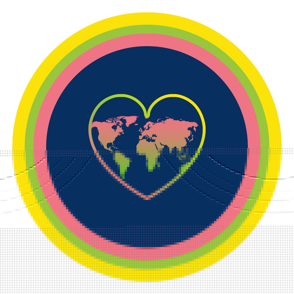
Brand imagery
The UEF animated logo and the four circular focus-area icons form the foundation of the visual identity.
Animated logo
Focus-area icons


Typography scale
Each specimen shows the class name and a rendered example so designers and developers can see exactly what they get.
.uef-display
The flourishing life begins with wonder
.display-title
A calmer, clearer design system
.uef-lede
We are keeping what already works: warmth, depth, books, courses, and a sense of spiritual seriousness.
.uef-kicker
Brand workbench
.uef-micro-label
Variant 1
Body text
Use serif display for thought and invitation. Use clean sans body for guidance, navigation, and dense reading.
prose-uef block
Flourishing is the state of living well — of realizing your potential in a way that benefits yourself and others. It combines purpose, connection, growth, and joy.
“The good life is one inspired by love and guided by knowledge.” — Bertrand Russell
Learn more about the UEF approach to flourishing and how you can integrate these principles into daily life.
Surfaces & containers
These classes define the layered depth of the UEF design system — from bright white panels to dark contrast surfaces.
.uef-panel
Primary white panel with strong shadow
Sample content inside this surface.
.uef-paper
Warm parchment surface for softer contexts
Sample content inside this surface.
.uef-art-stage
Large rounded container for media and art
Sample content inside this surface.
.surface-card
Standard content card with ring border
Sample content inside this surface.
.soft-panel
Warm tan background for callouts
Sample content inside this surface.
.dark-panel
High-contrast dark surface
Sample content inside this surface.
uef-chip
uef-rule
Content above the rule
Content below the rule
pill-link
Buttons
The Button component supports six variants and multiple sizes, built on Base UI primitives with CVA.
Variants
Sizes
With icons
Badges
Small inline indicators for categories, statuses, and metadata.
All variants
Cards
Cards combine header, content, and footer slots. Use the size prop for compact variants.
Full card
Card with image

Cards can include images as their first child for a media-forward layout.
Compact card (size=sm)
Form elements
Text inputs, search bars, and newsletter forms drawn from the live site.
Input states
Search bar pattern (from site header)
Newsletter form pattern (from site footer)
Accordion grid
Desktop: hover to expand and reveal descriptions. Collapsed panels stay wide enough to read. Mobile: horizontal snap-scroll carousel preserving the browsing feel.
4 items (flourishing themes)
Compassion, belonging, and the practices that help us feel more alive with one another.
Wisdom traditions, curiosity, and the habits of reflection that deepen a meaningful life.
Joy, creativity, embodiment, and the freedom to move through life with openness.
Recognize the stories that narrow our choices, distort reality, or keep us disconnected.
Compassion, belonging, and the practices that help us feel more alive with one another.
Explore moreWisdom traditions, curiosity, and the habits of reflection that deepen a meaningful life.
Explore moreJoy, creativity, embodiment, and the freedom to move through life with openness.
Explore moreRecognize the stories that narrow our choices, distort reality, or keep us disconnected.
Explore more6 items (religious themes)
The pursuit of wisdom and understanding beyond religious boundaries.
Timeless stories and legends that convey deeper truth across cultures.
Sacred ceremonies and traditions that create belonging and continuity.
Principles of right and wrong that shape human behaviour and societal harmony.
Ways in which faith and culture bring people together to form supportive communities.
Shared human experiences of love, compassion, and spirituality.
The pursuit of wisdom and understanding beyond religious boundaries.
Explore moreTimeless stories and legends that convey deeper truth across cultures.
Explore moreSacred ceremonies and traditions that create belonging and continuity.
Explore morePrinciples of right and wrong that shape human behaviour and societal harmony.
Explore moreWays in which faith and culture bring people together to form supportive communities.
Explore moreShared human experiences of love, compassion, and spirituality.
Explore moreTwin pillars
A structural component for exactly two concepts that support something bigger. Three layout variants — arch (immersive), columns (classical), and bridge (connected nodes).
Bridge — pediment line connecting two pillar nodes
Human Flourishing
UEF's research has distilled wisdom from centuries and continents into a simple but compelling framework for lasting well-being. It begins with engaging deeply with our three essential human longings: loving, learning, and playing.
Religious Literacy
The wisdom traditions are stronger than the walls that divide us. Religious literacy helps us approach sacred stories, symbols, and practices with curiosity instead of fear so we can understand both difference and common ground.
Hero carousel
Supports background images, portrait slides with φ text/image split, primary CTAs, and accent link chips. Auto-advances with dot indicators.
Full example (3 slides: 2 media + 1 portrait)
Despite unprecedented levels of material success, we today feel unfulfilled, anxious, and disconnected. This book offers a deeply intuitive solution: real well-being arises when we engage our deepest human longings to love, to learn, and to play in whatever we do.
Throughout history, religion has served as a moral compass guiding the behaviors, attitudes, and actions of humanity. This book demonstrates 54 themes that are common across all religions and other wisdom traditions with actual quotes from the scriptures.
After a highly successful career as the founding chairman of Blackstone India, Akhil Gupta embarked on a profound personal and academic journey. He studied psychology, spirituality, neuroscience, and philosophy to answer life's most pressing questions: What does it truly mean to live well?

Minimal (text-only, no background images)
A hero carousel with no background images — just clean text cards on the sky-blue stage. Useful for announcements, quotes, or text-focused messaging.
Each slide auto-advances every 5.5 seconds. Dot indicators at the bottom let the user jump to any slide. Arrow buttons appear on XL screens.
Sacred geometry & gestalt
UEF draws from wisdom traditions across all of space and time. Our layouts should reflect that depth — grounded in proportions that humans have found beautiful for millennia, organized by the perceptual principles that make information feel natural.
Golden ratio (φ = 1.618) — column splits
The golden ratio appears throughout nature and sacred architecture — from the Parthenon to Islamic geometric art to the spiral of a nautilus shell. We use it as the default proportion when splitting content into two unequal columns.
Content + sidebar
Blog post, course detail — prose dominates, sidebar supports
Hero text + media
Home hero, founder split — media/image takes the golden share
Featured post
Blog index featured — image is minor, text gets breathing room
Book cover + text
Book detail rows — text dominates, cover anchors
Centered prose width: max-w-3xl (768px) inside max-w-5xl (1024px) = 0.75, close to 1/φ (0.618). The text column is naturally the golden minor of the overall content area.
Fibonacci spacing scale
Rather than arbitrary spacing values, our vertical and horizontal rhythm follows a Fibonacci-based scale. Each step feels naturally related to its neighbors — because the ratio between adjacent values approaches φ.
Gestalt principles in use
Gestalt psychology describes how humans naturally perceive visual order. These principles aren't decorative — they're the reason layouts feel “right” or “off.” Every UEF page should leverage all six.
Elements near each other are perceived as a group. Our sections use tight inner spacing and generous outer breathing room to create clear content clusters.
Card grids, LLP pillar sets, form field groups, footer columns
Elements sharing visual traits (color, shape, size) are perceived as related. Consistent card treatments, badge styles, and kicker typography create pattern recognition across pages.
surface-card everywhere, uef-kicker on all sections, pill-link for all CTAs
The eye follows smooth paths. Our vertical reading flow uses alternating sand/white bands to create a gentle wave that carries the eye down the page.
Alternating section backgrounds, article scroll-reveal, hero-to-content transitions
The mind completes incomplete shapes. Cards with rounded corners and subtle shadows imply contained spaces without heavy borders. Focus-area circles suggest wholeness.
rounded-[24px] cards, circular portraits, icon circles, uef-panel
Perceiving objects as foreground against a background. Sand/parchment backgrounds recede, white panels advance. Dark panels create dramatic inversions for emphasis.
Sand bg + white cards, dark-panel for contrast, hero gradient overlays
Elements within a shared boundary are grouped. Container widths (max-w-3xl for prose, max-w-5xl for grids) define content regions without visible walls.
container-wide, max-w-3xl prose, max-w-5xl grids, surface-card boundaries
Page layouts
Zoomed-out wireframes showing the structural anatomy of each page type. Two-column splits use the golden ratio (φ = 1.618). Centered prose is set at 1/φ of the container width. Gestalt badges show which perceptual principles each layout relies on most.
Hero carousel, mission statement, insights, books, founder, video, accordion themes, media, quotes
Full-bleed hero image, centered prose at 1/φ width, scroll-reveal
1-of-1: φ-split hero with infographic, H1 below, asides, FAQ accordion, inline images
Full-bleed banner, video grid, optional audio band, split-features, prose, chip links
Full-bleed gradient hero at 1/φ, 6 Airbnb-style dimension cards in 3-col grid
Gradient hero, scrollable course card grid, external refs aside
Content-first: featured post IS the hero, taxonomy filter bar, 3-col grid
Hero image with gradient overlay, title at 1/φ, φ content/sidebar split
Sky-blue hero with φ-split topic nav, lesson blocks
Surface card header, sequential content blocks
Photo hero, two-column mission+vision, centered statement with focus icons
φ-split hero with portrait circle, bio prose, three-column sections
Warm gradient hero, alternating φ-split cover+text rows
Hero with press kit, featured coverage grid, media assets
Interactive quote browser (design TBD)
Inspiration
This is the running source list for layout, interaction, typography, and component directions worth testing before we lock the UEF brand system down.
Webflow
Strong survey of current interface directions. Good source for new visual languages we can test against UEF.
Open reference
Harvard T.H. Chan School of Public Health
Scroll-based content discovery with progressive depth. Each section previews content with a clear path to go deeper. Akhil: "By scrolling you know all their content — under each we can create another layer."
Open reference